
Quick answer
Video analytics helps streaming businesses understand how viewers discover, watch, and interact with content. Important metrics include views, watch time, average viewing duration, completion rate, engagement, audience retention, device usage, and viewer drop-off points. A video hosting platform can provide the infrastructure for content delivery, while an online video platform combines publishing and streaming capabilities. A video CMS helps organize video libraries, and an enterprise video platform can provide deeper analytics, access controls, and audience insights.
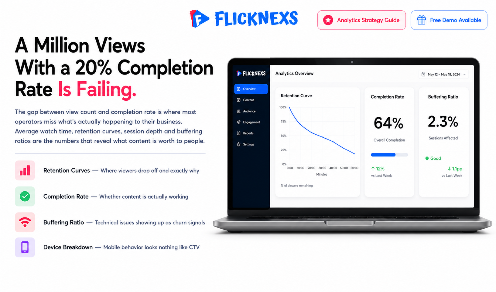
Basic view counts tell you almost nothing. The operators actually winning at this look at retention curves, drop-off points and device-specific performance instead, because that’s where the real story lives. To truly understand performance, operators need to analyze data from an online video platform and look beyond basic view counts.
Key Takeaways
- Retention over reach: Average watch time and retention curves reveal far more than total view counts because they show exactly where viewers drop off and how many clicked play.
- Monetization: follows engagement not the other way around. Higher completion rates and longer sessions translate directly into better ad inventory value and subscription retention. Engagement isn’t a vanity number sitting next to revenue. It’s what’s actually driving it.
- Buffering: isn’t just a technical glitch, it’s a behavior driver. Buffering events and startup times are primary reasons viewers abandon a stream and they need tracking right alongside content performance, not filed away separately as an “engineering issue.”
- Device changes everything: Viewer behavior on mobile looks nothing like viewer behavior on desktop or connected TV. Same reason you wouldn’t design a billboard and a business card the same way. Your strategy needs to bend to the device, not the other way around.
- Data without a feedback: loop is noise Raw numbers sitting in a dashboard do nothing on their own. The metrics only earn their keep when they’re actually shaping decisions on content acquisition, encoding settings and interface design.
What Problem Do OTT Operators Face When Relying on Surface-Level View Counts?
Most new streaming platform owners make the same mistake: they treat a view as a binary event. Click play, video loads, counter goes up by one. Feels safe, looks great on a dashboard, tells you almost nothing about whether your business is actually healthy.
A documentary channel that spikes in views after a social push looks like a win. But if people bailed thirty seconds in because of buffering or a content mismatch, that number is lying to you. Basic analytics on most white-label platforms, Flicknexs included, stop at “plays” and never tell you why someone left, where the video froze or whether they watched a twenty-minute doc versus a ninety-second teaser.
The fix is a mindset shift stop asking “how many people saw this” and start asking “how did they experience this.” Below is where that shift actually shows up.
| Old Metric | What It Hides |
What To Track Instead |
| Total view count | Whether viewers stuck around or left in the first minute | Average watch time and retention curves |
| Plays vs revenue | SVOD churn and AVOD ad inventory loss from early drop-off | Completion rate and session length |
| It’s a network issue | Buffering caused by bitrate encoded too high for average connections | Buffering events and startup time, cross-checked against completion rate |
| One number for VOD | Live viewers behaving nothing like on-demand viewers (Q&A vs skipped intros) | Separate behavior tracking for live vs. on-demand audiences |
| Single engagement score | Mobile, desktop and CTV users behaving completely differently | Device-specific engagement breakdowns |
| Raw dashboard data | Thousands of data points a second turning into noise, not decisions | A feedback loop feeding content, encoding and UI decisions |
Which Viewer Engagement Metrics Actually Predict Subscription Retention?
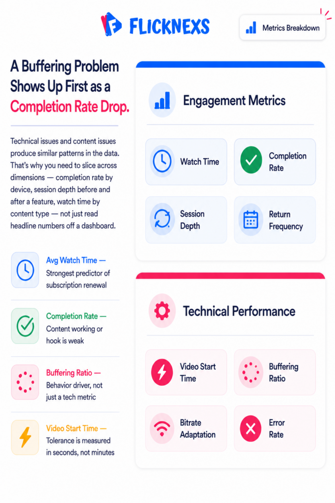
Not all engagement metrics tell you the same thing. Some warn you that churn is coming weeks before it arrives. Others just confirm what you already lost. Knowing which is which is the difference between running a retention strategy and writing post-mortems.
Average Watch Time is the strongest predictor of renewal. Not total views, not unique visitors. How long someone actually spends watching. High average watch time means members are finding value consistently. But look at it segmented, not as a single number. A mobile user watching a two-minute news clip and a TV user finishing a feature film both contribute to your average, and they tell completely different stories about platform health. Break it down by content type, device and user cohort and the picture gets useful.
Completion Rate tells you whether the content itself is working. High drop-off early in an episode usually means the hook is weak or the intro is too long. Consistently low completion across a licensed library means you’re paying for content your audience doesn’t actually want. Consistently high completion in a specific genre means you should be acquiring more of it.
Session Depth measures how many videos someone watches in one sitting. It’s a proxy for two things simultaneously: content quality and how well your recommendation engine works. A member who watches one video and leaves found what they needed or got bored. A member who watches five in a row is immersed. Session depth drops when the “Up Next” queue serves irrelevant content. It rises when your metadata and recommendations are genuinely good.
Frequency of Return is about habit formation. A member who visits daily has built your platform into their routine. A member who visits once a month is one skipped visit away from forgetting they’re paying for something. Low return frequency usually points to one of two things: a content library that’s too shallow to keep pulling people back, or a notification strategy that isn’t creating enough reasons to come back.
Churn Rate is the metric everyone watches and the one that helps you least in the moment. By the time churn spikes, you’ve already lost those members. The real work is using the metrics above to catch the signals before the cancellation happens. A member whose average watch time has dropped significantly over the past month is telling you something. A member whose session depth has collapsed is telling you something. Reach out before they make the decision, not after.
The metrics don’t live in isolation either. A buffering problem shows up first as a completion rate drop, then as lower session depth, then eventually as churn. Technical issues and content issues produce similar patterns in the data, which is why you need to be able to slice across dimensions, completion rate by device, session depth before and after a new feature, watch time segmented by content type, rather than just reading headline numbers off a dashboard.
Most operators over-invest in acquisition metrics and under-invest in the engagement data that actually predicts whether the business is healthy. Subscriber growth at the top of the funnel is meaningless if the engagement numbers underneath it are quietly pointing toward a retention problem that hasn’t fully surfaced yet.
How Do Technical Performance Metrics Directly Influence Viewer Behavior?
There is a pervasive myth in the streaming industry that content is king and technology is merely the servant. While content is undoubtedly crucial, technology is the gatekeeper. If the technology fails, the content never gets seen. Technical performance metrics are not just IT concerns; they are business-critical indicators that directly dictate viewer behavior and revenue.
Video Start Time (VST) is the first metric that matters. This is the time it takes from the moment a user clicks “Play” to the moment the video actually starts playing. Users have very little patience for buffering. If a video takes too long to start, abandonment rates increase sharply.
In the competitive OTT market, where users can switch to a competitor with a single click, VST is a differentiator. If your platform has a high VST, users will perceive your service as slow and unreliable, regardless of how good your content is. This is particularly critical for live streaming. If a user tunes in to a live event and has to wait too long for the stream to buffer, they may miss key moments.
Buffering Ratio measures the percentage of time a user spends waiting for the video to load while watching. A high buffering ratio is a direct signal of a poor user experience. It breaks the immersion. It frustrates the viewer. It leads to abandonment.
The relationship between buffering and churn is clear. As buffering increases, churn increases. But the impact varies. A user on a high-speed connection will tolerate less buffering than a user on a slower connection. This is why you must segment buffering data by network type and geography.
Bitrate Adaptation is another technical metric that influences behavior. Modern streaming protocols like HLS and DASH automatically adjust the video quality based on the user’s available bandwidth. If the adaptation logic is poor, the user might experience frequent quality switches, which can be jarring and cause users to turn off the stream.
Effective bitrate adaptation ensures a smooth viewing experience. It keeps the video playing at the highest possible quality without interruption. When this works well, the user is unaware of the technology. When it fails, the user notices immediately.
Error Rates track the frequency of playback failures. This includes crashes, black screens and “playback failed” messages. Even a small error rate can have a massive impact on user trust. If a user experiences a playback failure on their first visit, they are unlikely to return. If they experience it repeatedly, they will cancel their subscription.
Device-Specific Performance is crucial because user behavior varies by device. A user on a smart TV expects a different experience than a user on a mobile phone. Smart TV users often have larger screens and better connections, so they expect higher resolution and lower latency. Mobile users are more likely to be on cellular networks and may be more sensitive to data usage and battery drain.
If your analytics show that error rates are high on a specific device type, such as a particular model of smart TV, it indicates a compatibility issue. This could be a problem with the video player, the encoding format, or the network configuration. Identifying these issues quickly is essential to maintaining a high-quality user experience.
Latency is a specific concern for live streaming. In live sports or news, low latency is critical. If the stream is delayed, the user might see a spoiler on social media before the event happens on their screen. This destroys the value of the live stream.
High latency can also affect interactivity. If you are running a live Q&A session, high latency can make the interaction feel disjointed. Users might ask a question and wait too long for an answer, leading to disengagement.
To address these technical challenges, you need a robust infrastructure. This includes a Content Delivery Network (CDN) that is optimized for your geography, a transcoding pipeline that can handle various bitrates efficiently, and a video player that supports adaptive streaming and error recovery.
When comparing vendors, look for those that provide detailed technical analytics. Can you see the VST for every user? Can you track the buffering ratio by region? Can you identify which specific video assets are causing the most errors?
The connection between technical performance and business outcomes is undeniable. Poor technical performance leads to lower engagement and higher churn. Investing in technical performance is not an expense; it is an investment in user satisfaction. By monitoring these metrics closely and optimizing your infrastructure, you can ensure that your content reaches your audience in the best possible way.
What Is the Difference Between Quantitative and Qualitative Engagement Data?
Numbers tell you what’s happening. They don’t tell you why. Running a streaming platform on quantitative data alone is like reading a speedometer without looking at the road.
Quantitative data, view counts, watch time, completion rates, click-through rates, error rates, is where you spot the patterns. Completion rates for morning content consistently lower than evening. A spike in drop-offs at the same point in every episode. A specific device showing worse session depth than everything else. The numbers surface the problem and tell you where to look. They don’t tell you what you’ll find when you get there.
That’s where qualitative data comes in. User surveys, support tickets, session recordings, social listening. The stuff that’s harder to collect and impossible to put in a chart but gives you the context that makes the numbers make sense. A user who cancelled and told you the app was too slow is more useful than a hundred data points showing churn went up. A session recording that shows someone clicking the same broken button three times before giving up explains something no completion rate ever could.
Support tickets deserve more attention than most operators give them. Every ticket is a user telling you directly what’s wrong. Patterns in support volume, the same complaint appearing repeatedly across different users, are early warning signals that quantitative dashboards often miss entirely because the problem hasn’t scaled enough to show up in the aggregate yet.
The loop that works is this quantitative data identifies a trend, qualitative data explains it, you make a change, quantitative data measures the impact of qualitative data refines your understanding of whether you fixed the right thing. Each cycle around that loop makes the next decision easier and more grounded than the last.
When evaluating analytics tools, the question worth asking isn’t “how good are the dashboards.” It’s “can I connect the numbers to the human behaviour behind them.” Integration with survey tools, the ability to link support tickets to specific user sessions, ways to gather feedback inside the product itself. Those capabilities are what separate a reporting tool from something that actually helps you build a better platform.
How Can You Use Analytics to Optimize Monetization Strategies?
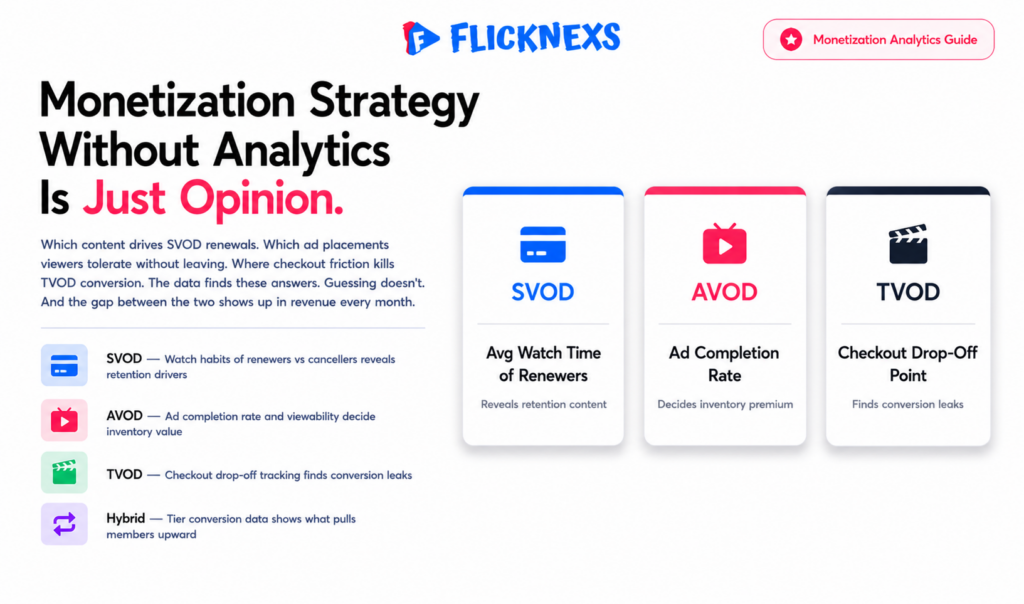
Monetisation strategy without analytics is just opinion. The data is what separates a pricing decision grounded in how your audience actually behaves from one grounded in how you assume they do.
SVOD: optimising for lifetime value
In a subscription model, the number that matters most isn’t new sign-ups. It’s how long subscribers stay and what keeps them there. Comparing the viewing habits of members who renew against those who cancel tells you which content is actually driving retention and which content is quietly associated with people leaving. That distinction shapes your acquisition budget, your content calendar and your tier structure far more usefully than total view counts ever will.
Pricing tier analytics matter here too. If 4K access is what drives upgrades from basic to premium, that’s worth knowing. If live events are the trigger, that’s a different content investment entirely. The data tells you which features justify higher prices in your specific audience’s mind, not in theory.
AVOD: optimising for ad revenue
Ad revenue lives or dies on two metrics most operators don’t watch closely enough. Ad completion rate tells you whether viewers are sitting through breaks or abandoning the stream the moment one starts. Viewability tells you whether the ad was actually seen at all, not just served. A served ad that nobody watched isn’t inventory you can sell at a premium for long.
Ad placement optimisation comes from knowing where in your content viewers are engaged enough to tolerate a break without leaving. That point varies by content type, by audience and by device. The data finds it. Guessing doesn’t.
TVOD: optimising for conversion
In a transactional model, the path to purchase is where revenue leaks. Tracking where users drop out of the checkout process, whether pricing is unclear, whether payment options are causing friction, identifies the specific fixes that move conversion rate. A title with high interest but low purchase completion has a different problem than a title with low interest. Analytics tells you which one you’re dealing with.
Across all models: the tools that move the needle
Dynamic ad insertion, personalised recommendations and A/B testing all depend on the same underlying capability: the ability to connect viewer behaviour to revenue outcomes at a granular level. Which ad formats perform with which audience segments. Which content recommendations lead to upgrades. Which price points convert at which tier. Without that granularity you’re running campaigns and hoping, rather than testing and knowing.
The hybrid approach, a free ad-supported tier, a paid subscription tier and individual purchase options sitting alongside each other, only works if you can track conversion between those tiers and understand what’s pulling people from one to the next. That visibility is what lets you optimise the user journey rather than just watching aggregate revenue move up or down and trying to work out why.
Why Does Device-Specific Analytics Matter for Multi-Screen Strategies?
Your members don’t pick one screen and stick to it. Someone starts a documentary on their phone during lunch, picks it up on a tablet in the evening and finishes it on the TV before bed. That’s normal viewing behaviour now and if your platform can’t track that journey or deliver well across all three screens, you’re losing engagement at every handoff.
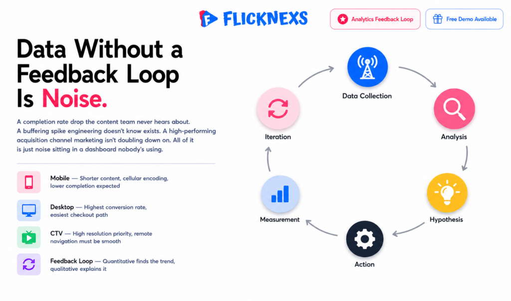
Device fragmentation is the underlying problem. Thousands of different devices, different screen sizes, different operating systems, wildly different network conditions. What works flawlessly on a high-end iPhone can fall apart on a budget Android. What looks cinematic on a 65-inch TV is unreadable on a small phone. Treating all devices as equivalent in your analytics and your delivery strategy is where most platforms quietly lose members they didn’t realise they were losing.
A few things worth tracking specifically by device:
- Buffering and video start time: High buffering rates on mobile often point to encoding settings that aren’t optimised for cellular networks rather than a content problem. The fix is technical, but you only find it if you’re segmenting by device.
- Completion rates: Mobile users tend to watch shorter content. If long-form completion rates are low on mobile, that’s expected behaviour, not a content quality signal. Misreading it leads to wrong decisions about your library.
- Session depth: A user who watches one video on their phone and then opens three more on the TV isn’t a low-engagement user. They’re a highly engaged user whose behaviour spans two sessions. Without cross-device tracking you misread them as two separate, shallow interactions.
- Conversion rates: Subscribing on a desktop with a keyboard is easier than subscribing on a TV with a remote. If your mobile and TV conversion rates are significantly lower than desktop, the checkout experience on those devices probably needs work before you spend more on acquisition.
- Navigation and UI performance: A TV remote and a touchscreen require fundamentally different interface logic. A member who can’t find content easily on their TV won’t troubleshoot it. They’ll watch something else.
The cross-device picture is where the most useful insights live. A user who starts on mobile and finishes on TV is telling you the content was worth switching screens for. A user who abandons on mobile and never returns is telling you something went wrong and without the cross-device view you can’t tell whether it was the content, the app, the network or something else entirely.
Optimise based on what the data actually shows for each device rather than applying a single strategy across all of them. Mobile delivery often benefits from lower bitrates and shorter content surfacing. TV delivery should prioritise high resolution and smooth navigation above almost everything else. Different screens, different priorities, same subscriber.
How Do You Build a Feedback Loop From Data to Actionable Strategy?
Collecting data is only the first step. The real value comes from turning that data into action. This requires a feedback loop that connects insights to strategy. Without this loop, your analytics are just a fancy dashboard.
The first step is Data Collection. You need to ensure that you are capturing the right data points. This includes quantitative metrics like watch time and completion rates, as well as qualitative data like user feedback.
The second step is Analysis. You need to look at the data and identify trends, patterns and anomalies. What is working? What is not? Why? This requires a deep get into the numbers and the context.
The third step is Hypothesis Generation. Based on your analysis, you form a hypothesis. For example, “If we improve the video start time, we will increase completion rates.”
The fourth step is Action. You implement a change based on your hypothesis. This could be a technical change, a content change, or a UI change.
The fifth step is Measurement. You track the impact of your action. Did the change have the desired effect? Did it improve the metrics?
The sixth step is Iteration. If the change worked, you scale it. If it didn’t, you analyze why and try something else.
This loop must be continuous. The streaming landscape is constantly changing. User behavior evolves. Technology advances. You must keep iterating to stay ahead.
Analytics only create value when the right people act on them. A completion rate drop the content team never hears about, a buffering spike engineering doesn’t know exists, a high-performing acquisition channel marketing isn’t doubling down on. All of that is just noise sitting in a dashboard nobody’s using.
Cross-functional visibility is what turns metrics into decisions. Content needs to know what’s resonating and what’s not. Engineering needs to see technical performance issues before they show up as churn. Marketing needs to know which channels are bringing in members who actually stay, not just members who sign up.
Automation keeps the loop from depending on someone remembering to check. Set alerts for the metrics that matter most: completion rate drops below a threshold, buffering rates spike on a specific device, a cohort’s login frequency falls off a cliff. Catching these signals the day they emerge is a different situation from catching them three weeks later in a monthly report.
Share findings regularly across teams and keep the reporting honest. Not just the wins. The metrics that are moving the wrong direction deserve as much attention in a stakeholder meeting as the ones that look good. A culture that only surfaces positive data stops being useful for making real decisions pretty quickly.
The competitive advantage isn’t having better data than everyone else. It’s building the internal habit of actually using it.
Frequently Asked Questions
Ready to build?
If you’re planning your next Analytics project, Flicknexs handles the video infrastructure end-to-end — so you can ship in weeks, not months.